December 6, 2024

December 6, 2024

Motown Records Rebrand

Motown Records Rebrand

Motown Records Rebrand

The Motown Records rebranding project revitalizes one of music history's most iconic labels, founded in Detroit in 1959 by Berry Gordy Jr. This visual identity refresh honors Motown's rich heritage while positioning the brand for contemporary relevance in today's digital landscape. The rebrand centers around the tagline "UNITE AND BRING PEOPLE TOGETHER THROUGH MUSIC," reflecting Motown's historical significance in bridging cultural divides through its revolutionary sound. Campaign messaging such as "Motown did it first" celebrates the label's pioneering spirit while asserting its continued influence on modern music and culture.

The Motown Records rebranding project revitalizes one of music history's most iconic labels, founded in Detroit in 1959 by Berry Gordy Jr. This visual identity refresh honors Motown's rich heritage while positioning the brand for contemporary relevance in today's digital landscape. The rebrand centers around the tagline "UNITE AND BRING PEOPLE TOGETHER THROUGH MUSIC," reflecting Motown's historical significance in bridging cultural divides through its revolutionary sound. Campaign messaging such as "Motown did it first" celebrates the label's pioneering spirit while asserting its continued influence on modern music and culture.

The Motown Records rebranding project revitalizes one of music history's most iconic labels, founded in Detroit in 1959 by Berry Gordy Jr. This visual identity refresh honors Motown's rich heritage while positioning the brand for contemporary relevance in today's digital landscape. The rebrand centers around the tagline "UNITE AND BRING PEOPLE TOGETHER THROUGH MUSIC," reflecting Motown's historical significance in bridging cultural divides through its revolutionary sound. Campaign messaging such as "Motown did it first" celebrates the label's pioneering spirit while asserting its continued influence on modern music and culture.

Woman
Woman
Woman
Woman

Year

2024

Client

Motown Records

Category

Music Studio

Product Duration

1 - 2 Weeks
Logo Design and the Logo Idea

The Motown Records logo features an innovative design concept where the iconic letter "M" is created through geometric shapes overlaid on a vinyl record illustration. This distinctive approach directly connects the visual identity to Motown's musical heritage and vinyl record production legacy. The logo design uses negative space and structural lines that intersect the vinyl record label, creating a stylized "M" that emerges from the circular form of the record itself.

The geometric construction incorporates:

  • Horizontal and vertical white lines that bisect the vinyl record

  • Circular elements that reference the record's center hole and outer edge

  • Strategic use of negative space to reveal the "M" form within these intersections

This conceptual approach gives the logo both literal and symbolic meaning - the "M" for Motown physically emerges from the vinyl format that helped make the label legendary. The design cleverly integrates the brand's identity with its primary product, creating a strong visual metaphor that communicates Motown's musical foundation. This logo system can function both within this vinyl context and as an extracted standalone element, providing flexibility while maintaining the conceptual connection to music recording across all applications.
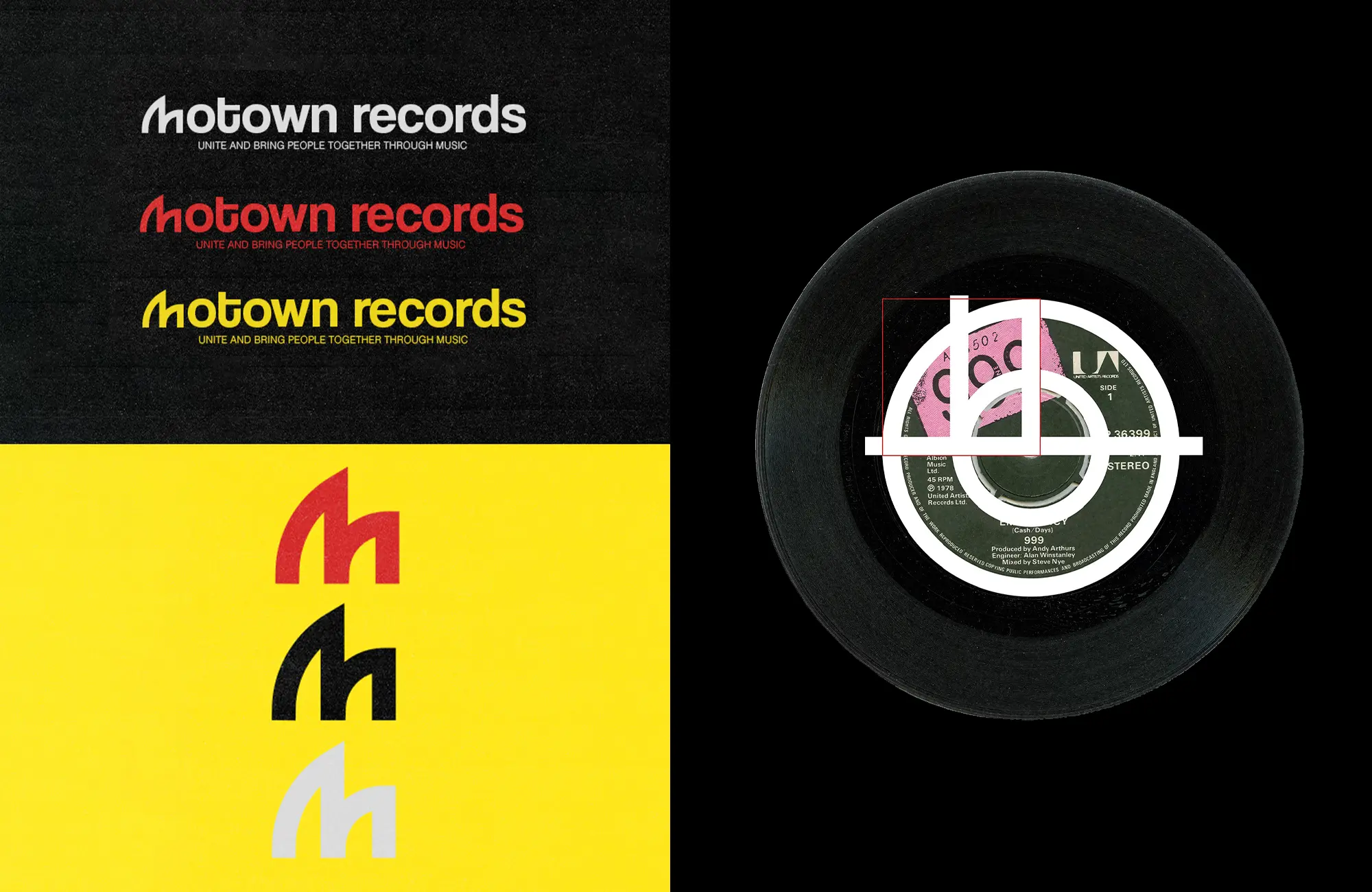
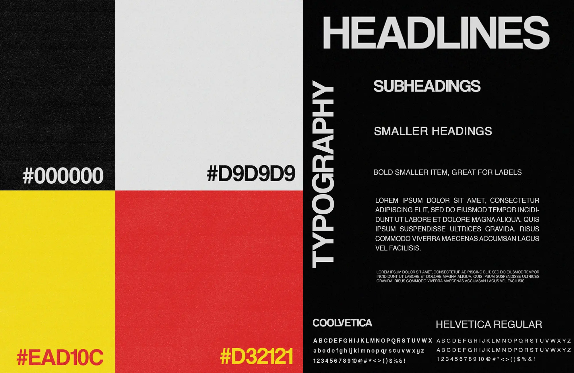
Woman in Garage
Woman in Garage
Woman in Garage
Color Palette and Typography

Color Palette

The Motown Records visual identity employs a bold, energetic color system:

  • Black (#000000) - Primary background color providing strong contrast

  • White/Light Gray (#D9D9D9) - For clean, minimal applications

  • Vibrant Yellow (#EAD10C) - For energy and attention-grabbing elements

  • Bold Red (#D32121) - For dynamic contrast and passion

These colors can be used independently or combined to create gradient effects, as seen in the vinyl record label design. The contrast between black/white elements and the vibrant yellow/red creates a powerful visual impact that stands out in both physical and digital environments.

Typography

The typography system uses a distinctive, contemporary sans-serif typeface for the main logotype, with characters that have subtle uniqueness, particularly in the lowercase "m." The tagline "UNITE AND BRING PEOPLE TOGETHER THROUGH MUSIC" appears in a more standardized, clean sans-serif font, creating hierarchy while maintaining visual cohesion.

The typographic system emphasizes clarity and impact, ensuring legibility across all applications while conveying the brand's confident and forward-thinking positioning. All branded messaging uses straightforward, impactful type treatments that complement the bold color palette.

Woman in Car
Woman in Car
Woman in Car
Mockups and Use Cases

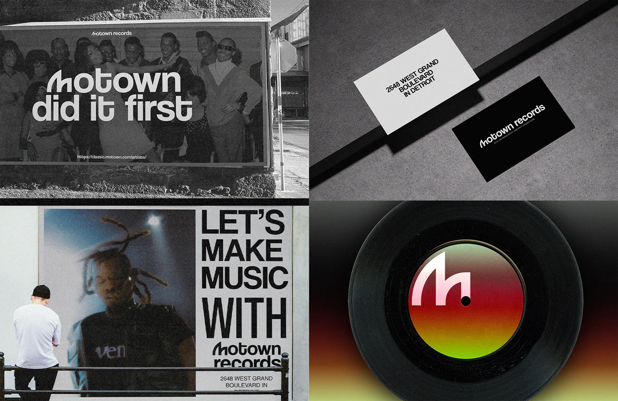
The rebranding system has been applied across various touchpoints to demonstrate its versatility:

Promotional Materials

  • Billboard campaign featuring the "Motown did it first" tagline with historical imagery

  • Posters with the message "LET'S MAKE MUSIC WITH MOTOWN RECORDS," showcasing modern artist imagery

Business Collateral

  • Minimal business cards in black and white, featuring the Motown Records logo

  • Contact information cards with clean typography on white background

Merchandise

  • T-shirts featuring "THE MOTOWN SOUND" in bold red against black fabric

  • Various branded items using the distinctive "M" symbol as a recognizable brand mark

Music Products

  • Vinyl record labels incorporating the "M" symbol with gradient color treatments

  • Album packaging featuring the new visual identity system

Each application demonstrates how the brand system maintains consistency while adapting to different contexts and formats, ensuring that Motown Records presents a cohesive yet flexible identity across all consumer touchpoints.

Woman in Garage
Woman in Garage
Woman in Garage
  • More Works More Works

03

//FAQ

Concerns

Frequently

Asked Questions

01

What services do you offer?

02

How do you approach creating cover art for clients?

03

What is your pricing structure?

04

Can I request revisions to the design?

05

How long does a typical project take?

06

Do you only work with musicians or tech startups?

03

//FAQ

Concerns

Frequently

Asked Questions

01

What services do you offer?

02

How do you approach creating cover art for clients?

03

What is your pricing structure?

04

Can I request revisions to the design?

05

How long does a typical project take?

06

Do you only work with musicians or tech startups?

//FAQ

Concerns

Frequently

Asked Question

What services do you offer?
How do you approach creating cover art for clients?
What is your pricing structure?
Can I request revisions to the design?
How long does a typical project take?
Do you only work with musicians or tech startups?

03

//FAQ

Concerns

Frequently

Asked Questions

01

What services do you offer?

02

How do you approach creating cover art for clients?

03

What is your pricing structure?

04

Can I request revisions to the design?

05

How long does a typical project take?

06

Do you only work with musicians or tech startups?

Let'S WORK

TOGETHER

BASED IN Los MOROCCO,

AGADIR

Visual Identity Designer
+ Music Brand Strategist

Let'S WORK

TOGETHER

BASED IN Los MOROCCO,

AGADIR

Visual Identity Designer
+ Music Brand Strategist

Let'S WORK

TOGETHER

BASED IN Los MOROCCO,

AGADIR

Visual Identity Designer
+ Music Brand Strategist

Create a free website with Framer, the website builder loved by startups, designers and agencies.