Year
2025
Client
Etools Hub
Category
Digital tools
Product Duration
1 - 2 Weeks
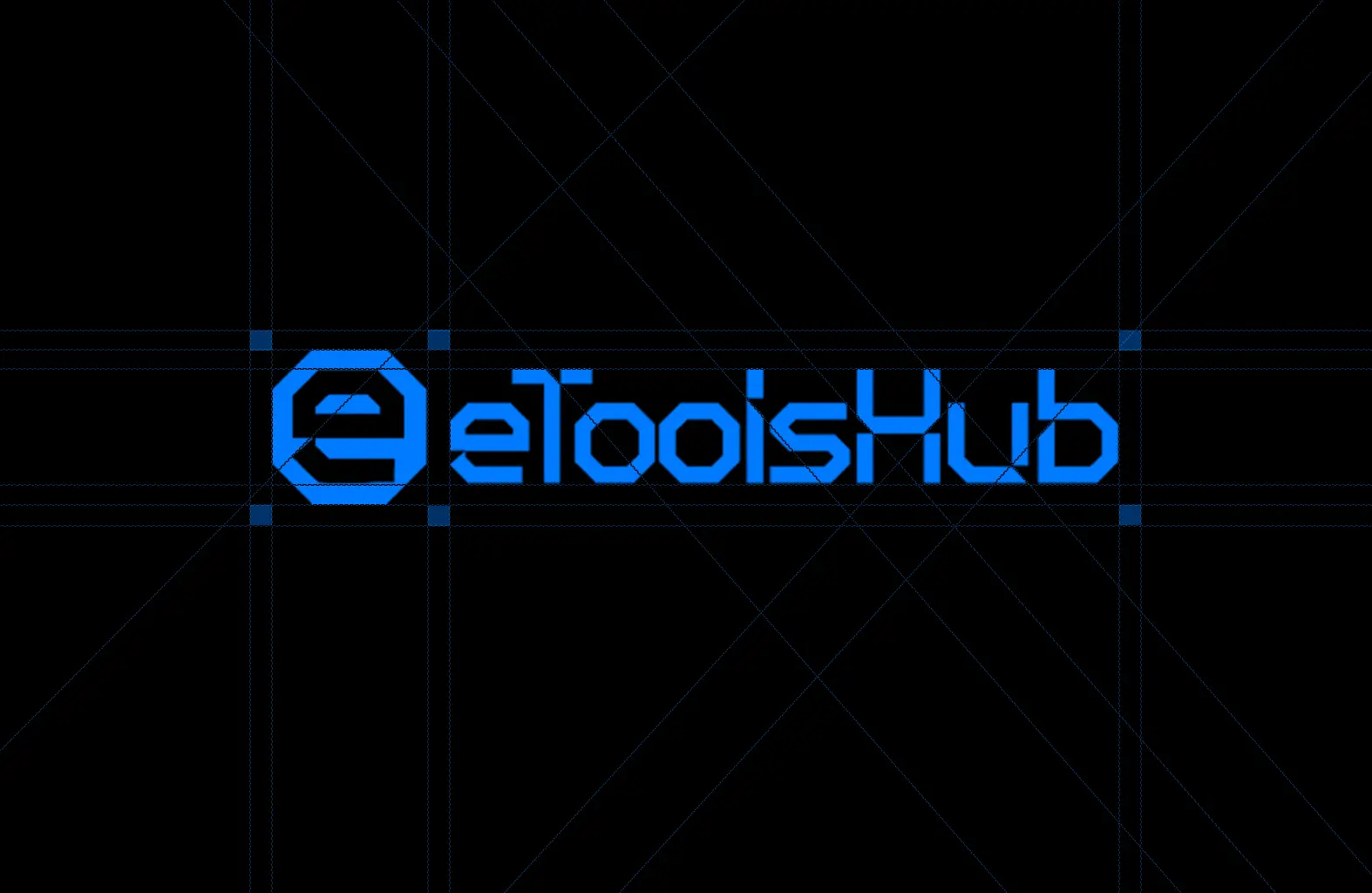
The eToolsHub logo centers around an innovative geometric concept that embodies digital precision and accessibility. The primary mark features a distinctive octagonal "e" symbol constructed using a precise grid system that ensures perfect proportions and balance. This geometric approach creates a memorable icon that functions effectively at various sizes across digital platforms.
The logo system includes several variations: a standalone "e" mark for app icons and limited spaces, a full logotype for primary brand identification, and various lockups for different applications. The octagonal structure of the "e" symbolizes the structured, organized nature of digital tools while maintaining a friendly, approachable feel through its rounded edges and open counter space.
The construction grid visible in the design files demonstrates how each element has been carefully positioned according to mathematical principles, ensuring the logo maintains consistent proportions across all implementations. This technical foundation gives the brand a professional credibility while the simplified forms maintain excellent legibility at small sizes for digital applications.
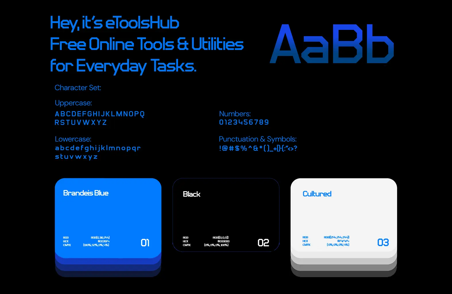
The eToolsHub visual identity employs a distinctive sans-serif typeface with slightly rounded terminals and a contemporary tech-friendly aesthetic. The typography system uses varying weights to create clear hierarchy across applications, with the primary brand headlines using a medium weight that balances visibility with approachability. The character set includes both uppercase and lowercase letterforms, numbers, and a comprehensive set of punctuation symbols to accommodate all communication needs.
The color palette is anchored by "Brandeis Blue" (#0066FF) as the primary brand color, creating strong recognition and conveying trust, reliability, and technological innovation. This vibrant blue is complemented by a simple but effective secondary palette:
Brandeis Blue (#0066FF): Primary brand color for logos, buttons, and key elements
Black (#000000): For text, icons, and creating contrast
Cultured (White/Light Gray): Background color and negative space
This focused palette ensures brand consistency while providing sufficient contrast for accessibility requirements. The system demonstrates excellent versatility across digital interfaces, allowing for both dark and light mode implementations while maintaining the brand's distinctive visual personality.
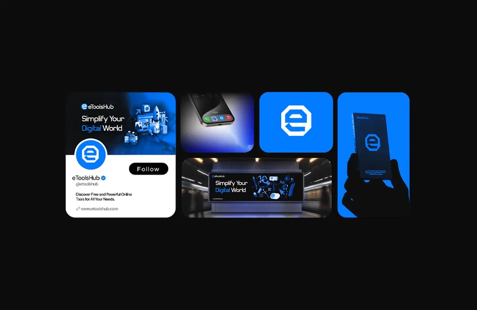
The eToolsHub visual identity demonstrates outstanding versatility across multiple digital touchpoints. The system has been implemented across:
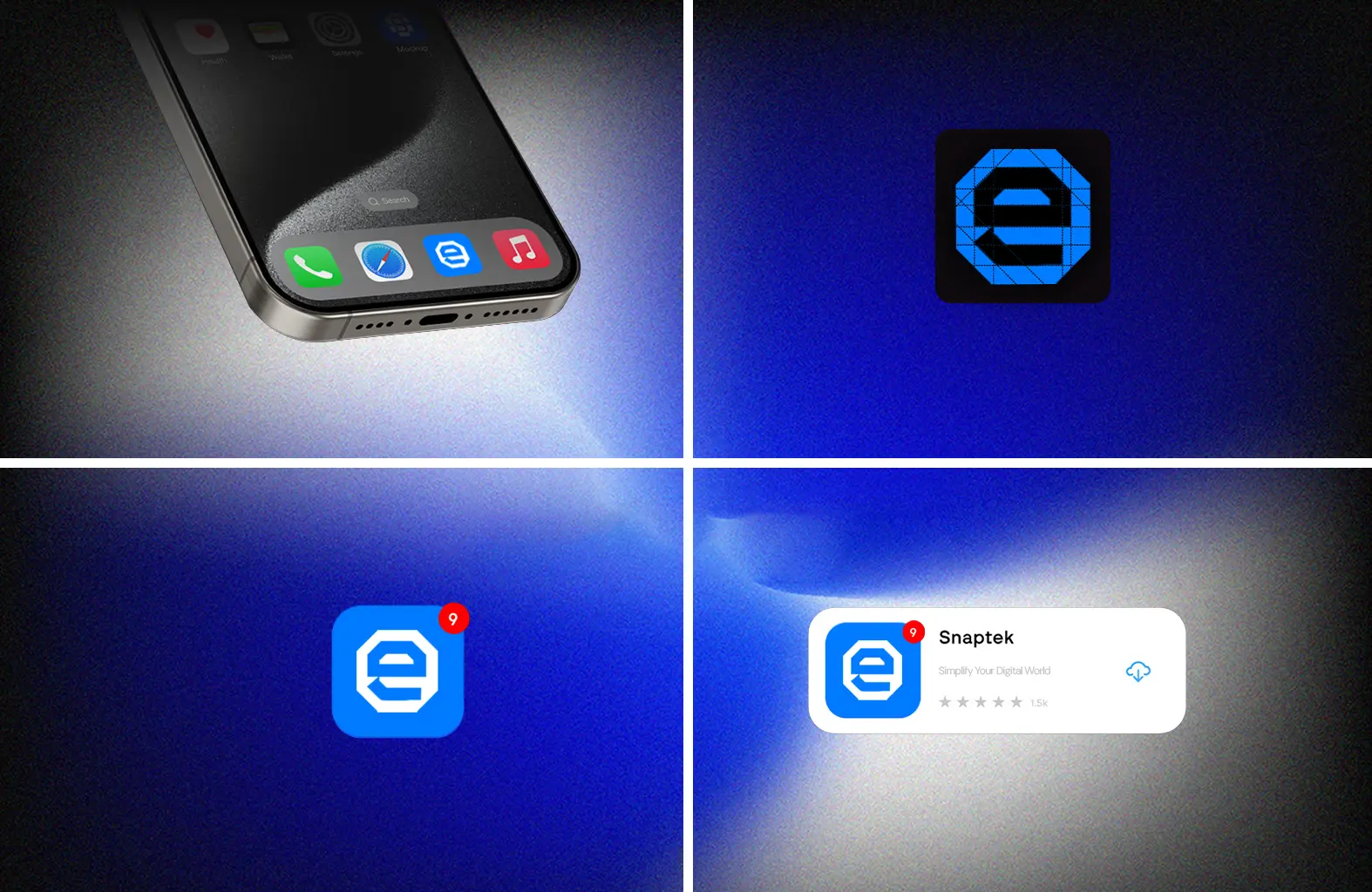
Mobile Application: The app icon features the distinctive "e" symbol on the Brandeis Blue background, with notification badges seamlessly integrating into the design. The app interface maintains the clean, blue-and-white aesthetic for optimal usability.
Social Media Presence: Profile cards and social media templates incorporate the "Simplify Your Digital World" tagline alongside the eToolsHub logo, creating a consistent brand experience across platforms.
Digital Advertising: Billboard and transit advertisements showcase the brand in context, with clear messaging that emphasizes the platform's value proposition.
Website Interface: The website design implements the color system and typography consistently, with appropriate white space and hierarchy to enhance usability.
Each implementation maintains the core visual elements while adapting to the specific requirements of each medium. This flexible yet cohesive approach ensures that eToolsHub maintains strong brand recognition regardless of where users encounter it in the digital ecosystem.